
Blackerby Violin Shop
UX Design | UI Design
↑ 46% ENGAGEMENT
↑ 27% SITE TRAFFIC
↑ 5X ONLINE SALES
Blackerby Violin Shop has provided Austin’s orchestral community with string instrument products and services since 1995. It is a business frequented by string players of all levels.


The Problem
Blackerby’s website was created to drive E-commerce and inform customers of store processes and pricing before coming in. There were various instruments posted for sale on Blackerby’s website, as well as pages for rental and repair services; however, online sales were sparing and customers often came in without any knowledge of Blackerby’s services or how they worked.
Gathering Information
Observe
I first took some time to gather information about Blackerby’s processes, services, and customer base by speaking with Blackerby staff, observing the in-store Blackerby experience, and analyzing Blackerby competitors.
Analyze
I then walked through Blackerby’s website on my own to better understand what information and products it currently offered, and how that information was presented.
Evaluate
Through these processes, I discovered that Blackerby’s website wasn’t consistent in its design elements, was text-heavy, instrument focused, and lacked information on its listed products.
User Research
I then conducted user interviews with local orchestral musicians to understand users needs, frustrations, and buying behaviors in respect to string shop websites.
Through these processes, I discovered that Blackerby users:
Valued products that were high-quality, in-budget, and quick to get in their hands
Sought out transparency, welcoming atmosphere, and string instrument knowledge in a string shop
Were weary of buying instruments online without understanding it’s condition and sound, but open to accessory purchases.
The Solution
From the information I gathered through my information gathering and user research sessions, I found that the most important focuses of Blackerby’s website needed could be broken down into four parts: atmosphere, online shopping, try before you buy, and performance hall.
Atmosphere
Blackerby’s most prominent competitive advantage was its reputation as a small, local business with a welcoming atmosphere and transparent processes. To emphasize Blackerby’s small business status, I employed a cozy color palette of dark greens, browns and reds and homey serif fonts. To more clearly communicate Blackerby’s professionalism, I standardized the website components for a cleaner UI, developing uniform styles for buttons, images, website text and other commonly utilized website elements.
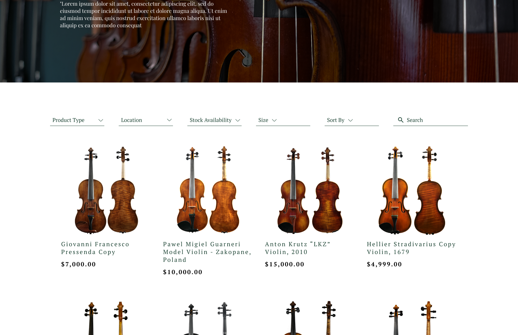
Online Shopping
I focused next on better integrating online shopping into Blackerby’s website through its home, shopping and product detail pages. On the homepage, I added sections at the top of the page to highlight categories of purchasable instruments (violins, violas, etc.) with accompanying images to encourage users to browse the in-store and online inventory.
Try Before You Buy
Rentals were one of Blackerby’s most popular services, but the webpage suffered from long text with few breaks, and was lacking in important information up front. To combat the large amount of information I made the page easier to digest by breaking up the text with relevant and informative visuals and images.
Performance Hall & Reservations
Blackerby’s performance hall had two dedicated pages: one where users could submit requests to book it, and one to explain its purpose, limitations and pricing. Previously, the booking page had no indication of what time slots were available, and users would need to switch to the event calendar page to determine when to book. To facilitate the booking process, I included a calendar beside the booking form so users could both see the performance hall availability and fill out the details of their request on the same page. On the informational page, I broke up the text of the performance hall and teaching studio info into several sections with accompanying imagery for ease of user understanding.