CATPROFILER
UI Design | Brand Design | Visual Design
↑ 195% PAGEVIEWS
↑ 579% INCREASE IN APP SALES
CatProfiler is a San Antonio based cat behavior expert that specializes in reuniting lost cats with their families and improving unruly cat behavior. They provide in person behavior and lost cat consultations, and also offer a lost cat focused web application that allows owners to input their missing pet’s information and receive a personalized behavioral profile to guide them in their search.


The Problem
CatProfiler was struggling to both attract site traffic and make conversions for their lost cat application, and felt that their brand didn’t accurately reflect their business.
Gathering Information
Discover
Before we could rework CatProfiler’s website design, we needed to evaluate what kind of business CatProfiler was, where they stood in relation to other online pet services, and what was and wasn’t working on their existing website.
To start, we conducted discovery sessions where we worked with CatProfiler to understand their brand goals, pain points, target audience, measures for success and overall vision.
Analyze
Once we gained a clear understanding of CatProfiler and their goals, my team set to work to identify areas for improvement with CatProfiler’s existing website in regards to its visuals, copywriting, and flow by working through basic website tasks.
Finally, we took some time to analyze CatProfiler’s business domain and competitive landscape to understand how we could best represent CatProfiler to make their brand stand out.
Evaluate
We found that:
CatProfiler felt their brand was too dark and depressing, and wanted to inspire more positivity in their users
The current website had large blocks of text, making it difficult to skim the page for relevant information
There were few up-front statistics and visuals to inform users of what they were purchasing
CatProfiler’s web application did not stand out as a purchase option on the website
CatProfiler only had PayPal as a checkout option, which many users may not have
The Solution
Color & Spacing
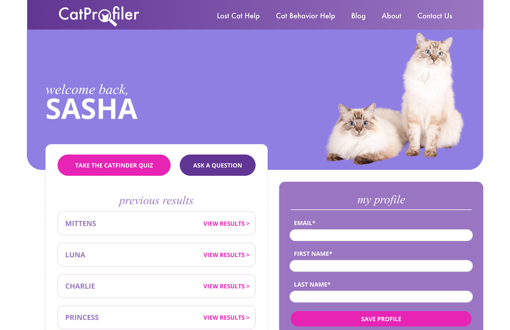
We kicked off the redesign with a soothing color palette with an emphasis on gradients and shades of purple to imbue the brand with a sense of welcoming, hope and dependability.
To break up the large blocks of text, we utilized relevant iconography and images, and reworked section structures to make content more concise and easy to navigate while still accurately communicating CatProfiler’s message.
Numbers
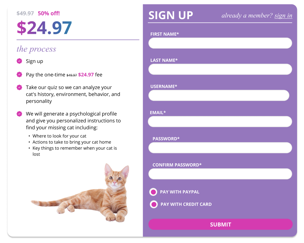
To shift the focus of the website to CatProfiler’s web application, we brought it to the forefront of key pages through:
Comparative pricing tables and calls to action to communicate the application’s value and drive users to the registration page
Statistics, data visualizations and testimonials for credibility.
Details
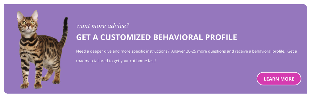
In order to increase purchase confidence, we needed to consider the user journey prior to app registration. I proposed the creation of a new lost cat help page, meant for users who were unsure about buying and want more in depth information on CatProfiler’s different lost cat services.
On this page, we delved further into the processes and results behind CatProfiler’s services including explanations, images displaying how CatProfiler’s web application works, and relevant iconography to increase user understanding of CatProfiler’s products. Calls to action were included on this page as well, to direct users to the registration page with newfound confidence.
Registration
Finally, on the registration page we included a step-by-step of the purchase and application’s process for users who hadn’t visited the lost cat help page, as well as web application FAQs and links to CatProfiler’s success stories page to ease common lingering concerns users may have before making their final purchase.
We utilized a stripe integration to allow for a credit card payment option for non PayPal users.