PLATTERPUS
Brand Design | Print Design | Visual Design
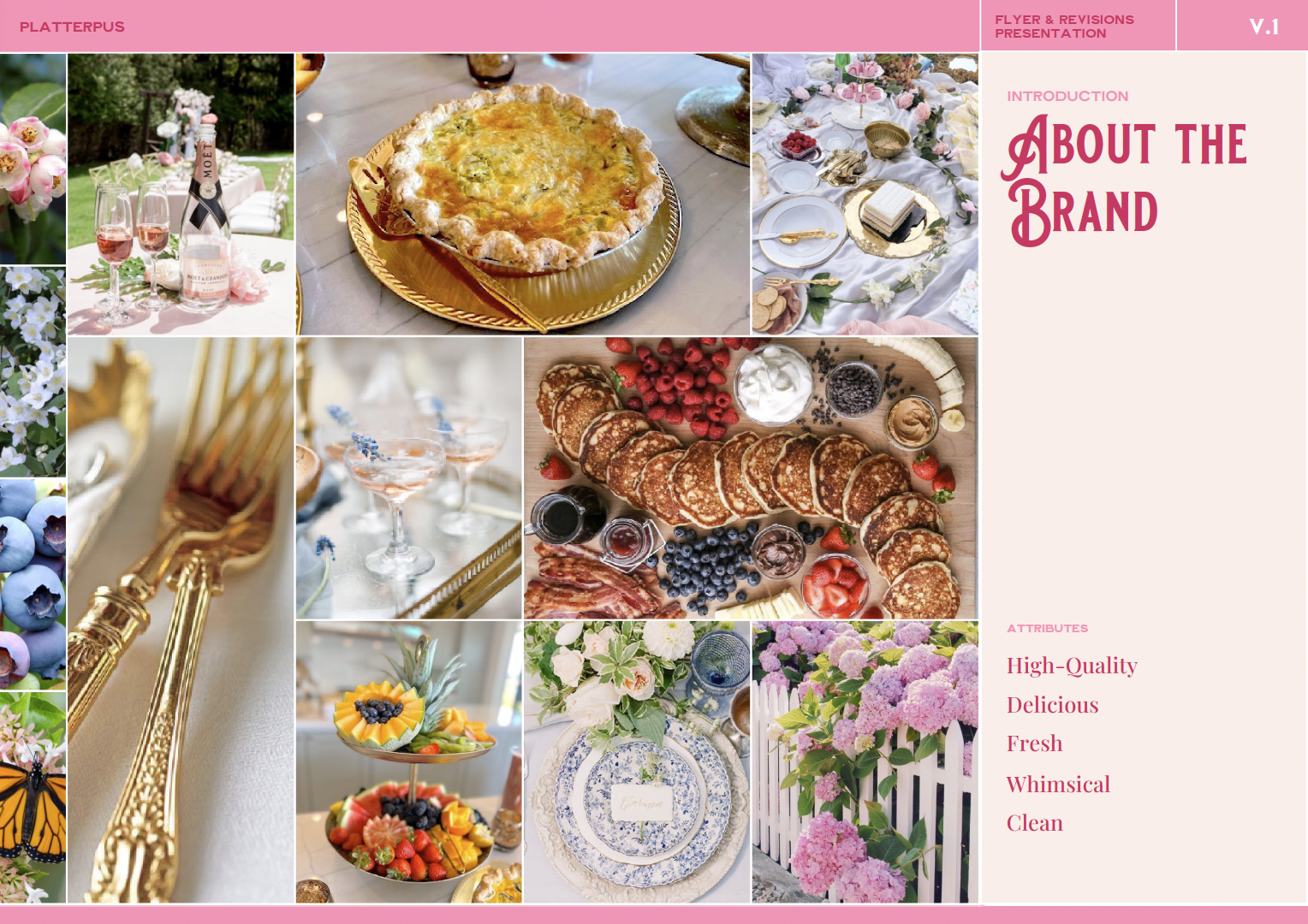
Platterpus is a platypus themed charcuterie business based in Boise, Idaho seeking to provide its local community with high-quality charcuterie presentations — fresh, local and luxury.


The Problem
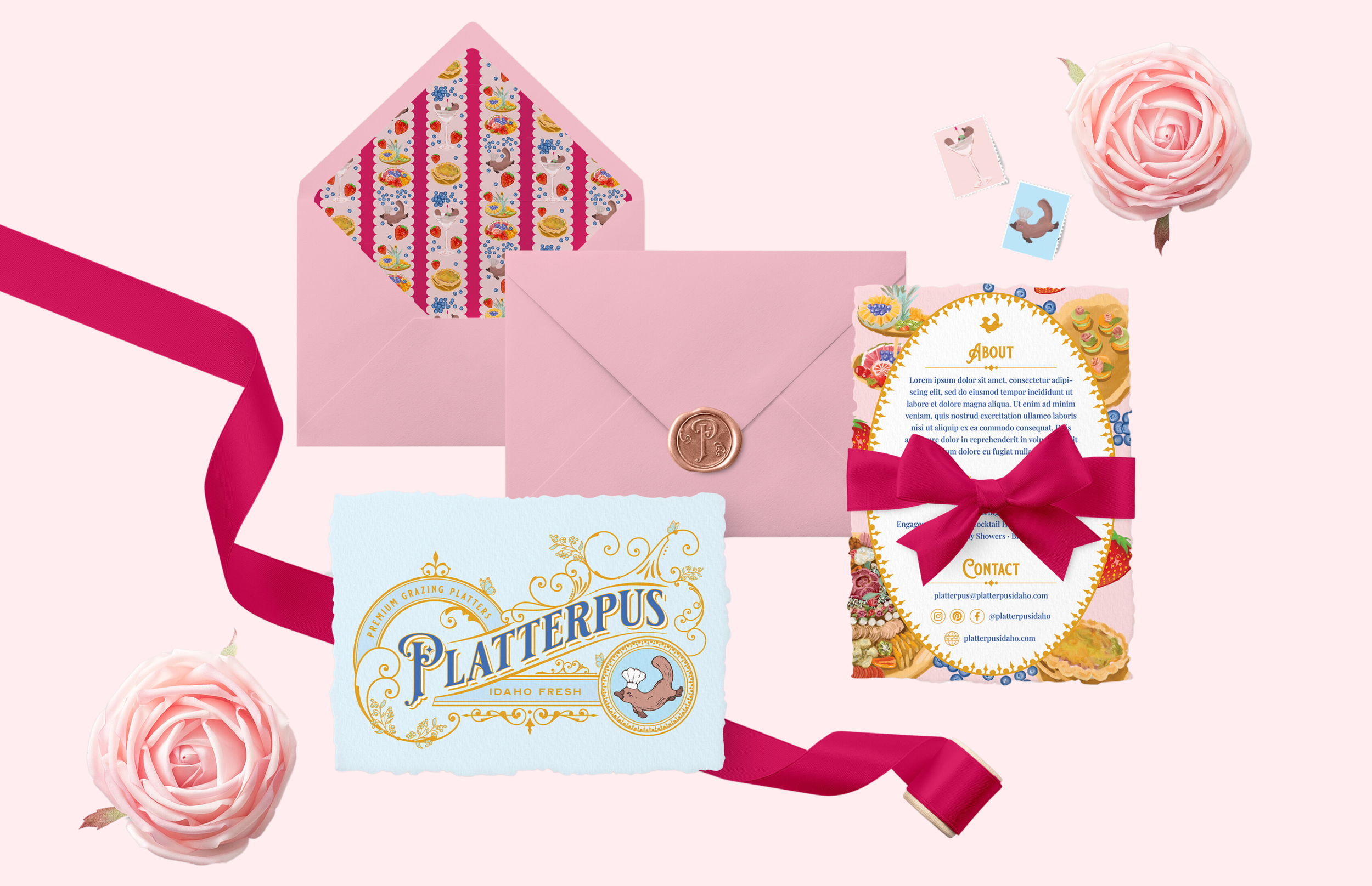
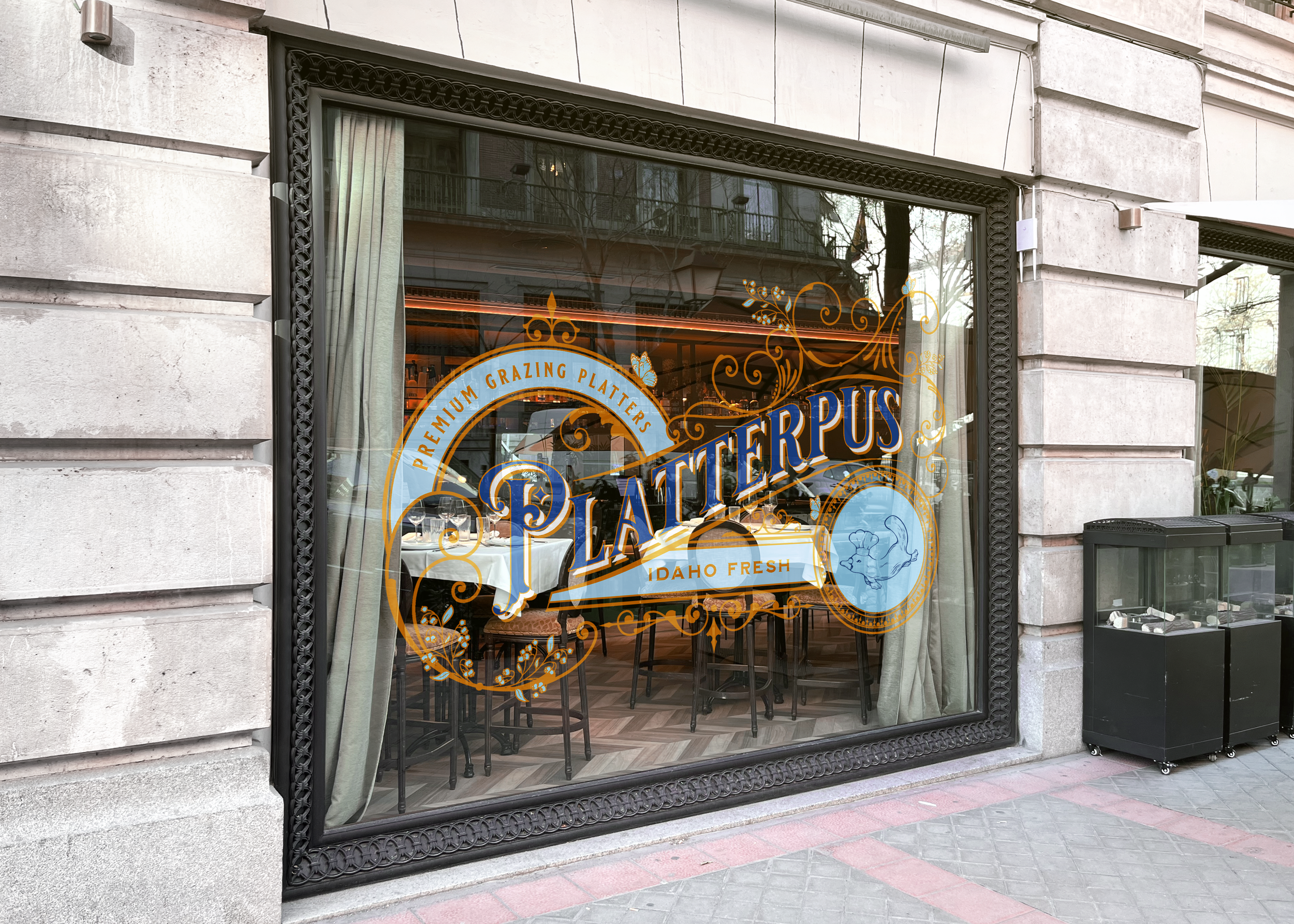
Platterpus needed a full branding package that reflected their business, combining the elements of “platypus” and “luxury” in a cohesive and appealing manner.
Information Gathering
Discover
During our discovery meetings we took extra care to understand Platterpus’s goals and target market due to their unique desires for their brand. Platterpus didn’t have a pre-existing idea of what they wanted for their brand, so we curated a collection of different design styles to walk them through to see what appealed to them most.
Evaluate
We found that Platterpus:
Had an older, upperclass demographic
Wanted to include a platypus mascot while maintaining upper class feel
Prioritized their local Idahoan community
Took pride in their fresh, local ingredients
Enjoyed whimsical, high end designs
The Solution
With our newfound understanding of Platterpus, we crafted a brand identity that reflected the key elements of their product: fresh, local, and luxury.
Grandmillenial
The most challenging aspect of building Platterpus’s brand was combining the rustic and casual concept of a platypus mascot while maintaining the high-end image Platterpus wanted to embody. To appeal to Platterpus’s older, upper-class demographic, we concluded that the Grandmillennial style - an aesthetic that combines traditional elements with modern colors and styling - fit the bill.
Colors & Symbols
We utilized cool pastels, ornate borders and florals to communicate Platterpus’s luxury brand while keeping a whimsical feel. What made Platterpus’s product special was their fresh, local ingredients, so we included the phrase “Idaho Fresh” as a tagline in both of Platterpus’ logos, and put it at the forefront of their print materials through text and imagery of baked goods, berries, and charcuterie.